Mobile App Design
Transforming Individual Businesses into a Coordinated Ecosystem
As my first client project at Xccelerate, I was asked to redesign My HKT, a mobile app that allows Hong Kong Telecom customers to manage the company's services. This project was a success, and I am delighted to have been hired as the company's in-house UXUI Designer.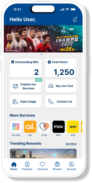
My Role
Team
UX Research
Wireframing
Prototyping
Usability Testing
Final Presentation
Xccelerate Aug 2022 CohortClient
Duration
Hong Kong TelecomOct 31 to Nov 25, 2022Challenges
As one of the largest telecommunications companies in Hong Kong, HKT provides a plethora of services, from broadband and mobile communications to media entertainment, MedTech, and FinTech.
With such a wide range of services, how may we leverage this superapp to create a cross-functional ecosystem?
Goal
To increase My HKT’s usage rate, user retention rate, overall attractiveness and transform it into a cross-functional ecosystem of individual businesses.
To get the project started, the team met virtually for a brainstorming session and came up with a few ideas to improve the app.
Brainstorm
Ideas
Allowing users to log in to all the HKT children apps they’ve registered.

One-Click Login
Allowing users to manage and pay for all bills that lie within HKT’s service scope.
Bill Management
Notifying users of rewards updates.

Reward Notifications
Forum
To create a little community within the app where people can talk and exchange ideas.
A total of 96 survey responses from potential users were collected, with respondents ranging in age from 18 to 59. Some key findings are:
Survey
All My HKT users use the app to pay and check bills. (100%)
Some HKT’s customers use HKT’s media entertainment services e.g. ViuTV, MOOV, NowTV, and NowE. (51%)
Most respondents believe the most appealing member incentive is a cash rebate. (79%)
The team conducted 37 interviews, three of which I was in charge of conducting via Zoom calls. Below are some examples of verbatim quotes from interviewees that are worth noting.
Interview
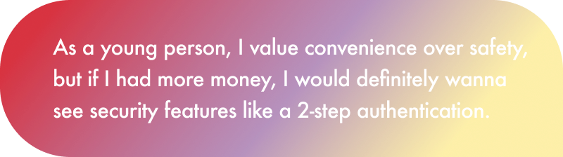
On One-click Log In
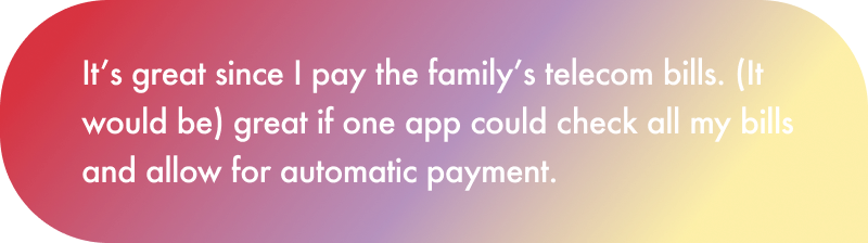
On Bill Management

On Reward Notifications
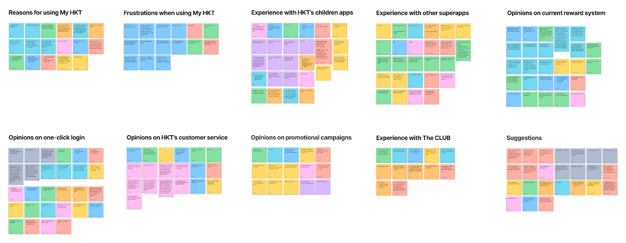
An affinity map was built to summarize the research findings.
Affinity Map
One-Click Login

Bill Management
Reward Notifications

Forum
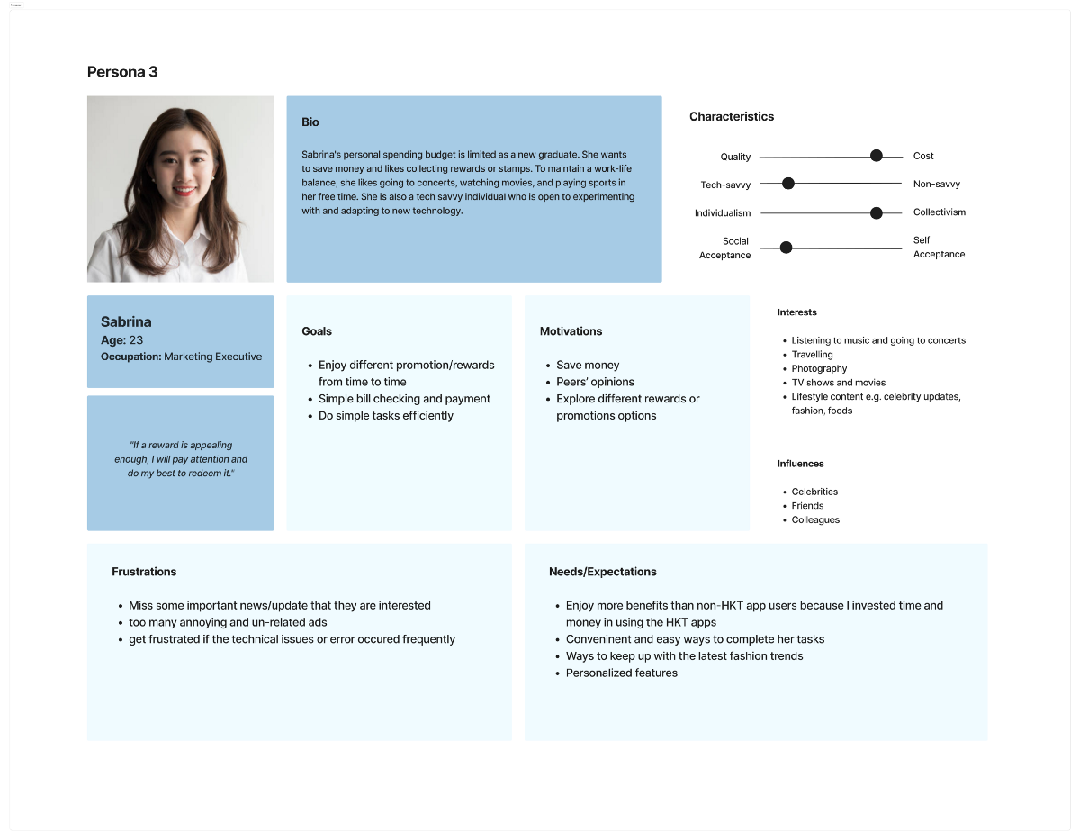
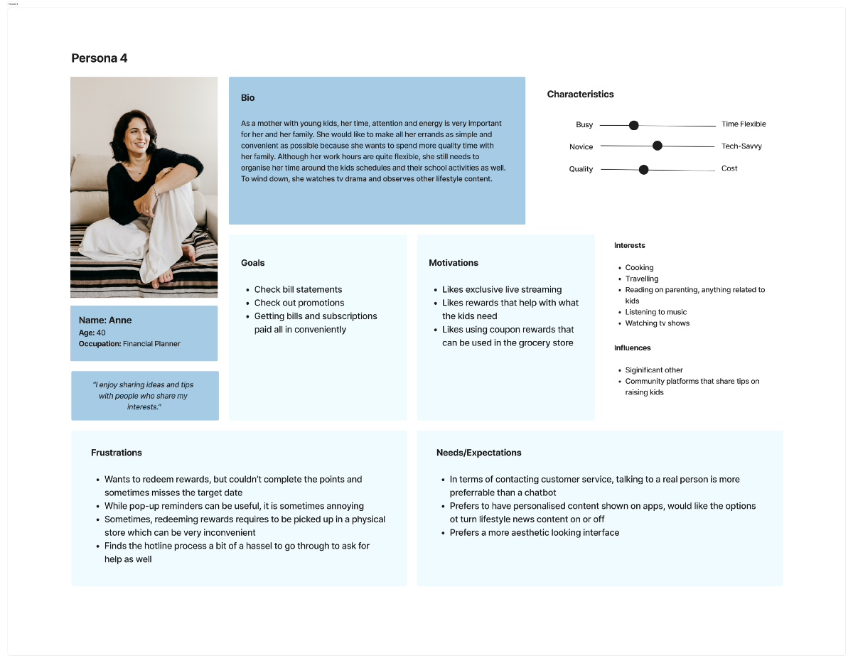
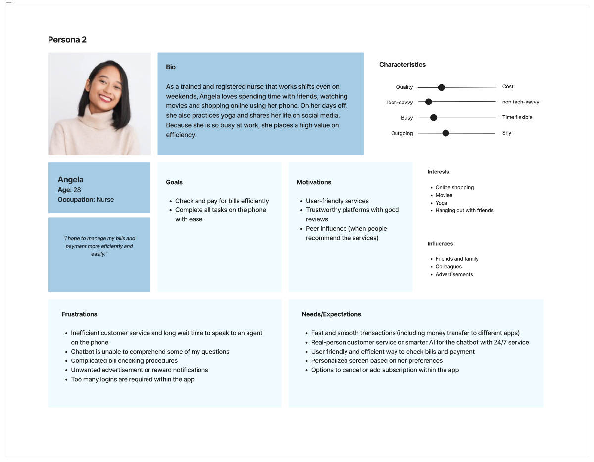
Personas
Four user personas were crafted which helped us understand what frustrates the users or may have prevented them from using the app.
Most users want faster and smoother bill payment procedures. Some users want to see personalized content on the app, be it rewards they’re interested in or industry news updates. At last, users should be able to reach a human customer service representative, which should ideally be built upon the use of a chatbot.

Site Map
Before diving into the design process, we created a sitemap to organize the information we want on the app. We believe the app’s five most important screens are the Home Page, Bill Payment, Rewards, Favorite, and Log In.
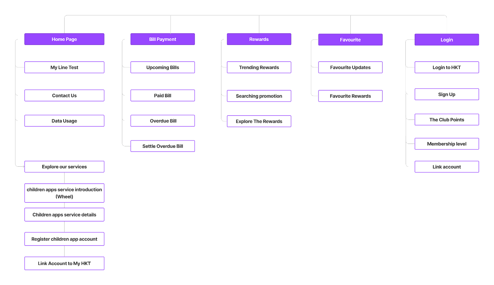
The home screen should include all of the most frequently used features, such as “Contact Us” and “Data Usage.”
Users would be able to manage and pay their bills through the bill payment screens.
The reward screens are for when a user wants to explore the latest rewards and/or upcoming promotions.
The favorite screen functions similarly to the bookmark feature in any other app. On this screen, a user can bookmark and easily browse any promotions that they have added to their “favorite”.
Finally, the login screen will perform the fundamental function of logging into the app.
Usability Test
Five rounds of usability testing were conducted to see how users interacted with the product, one of which I was in charge of conducting via Zoom call.
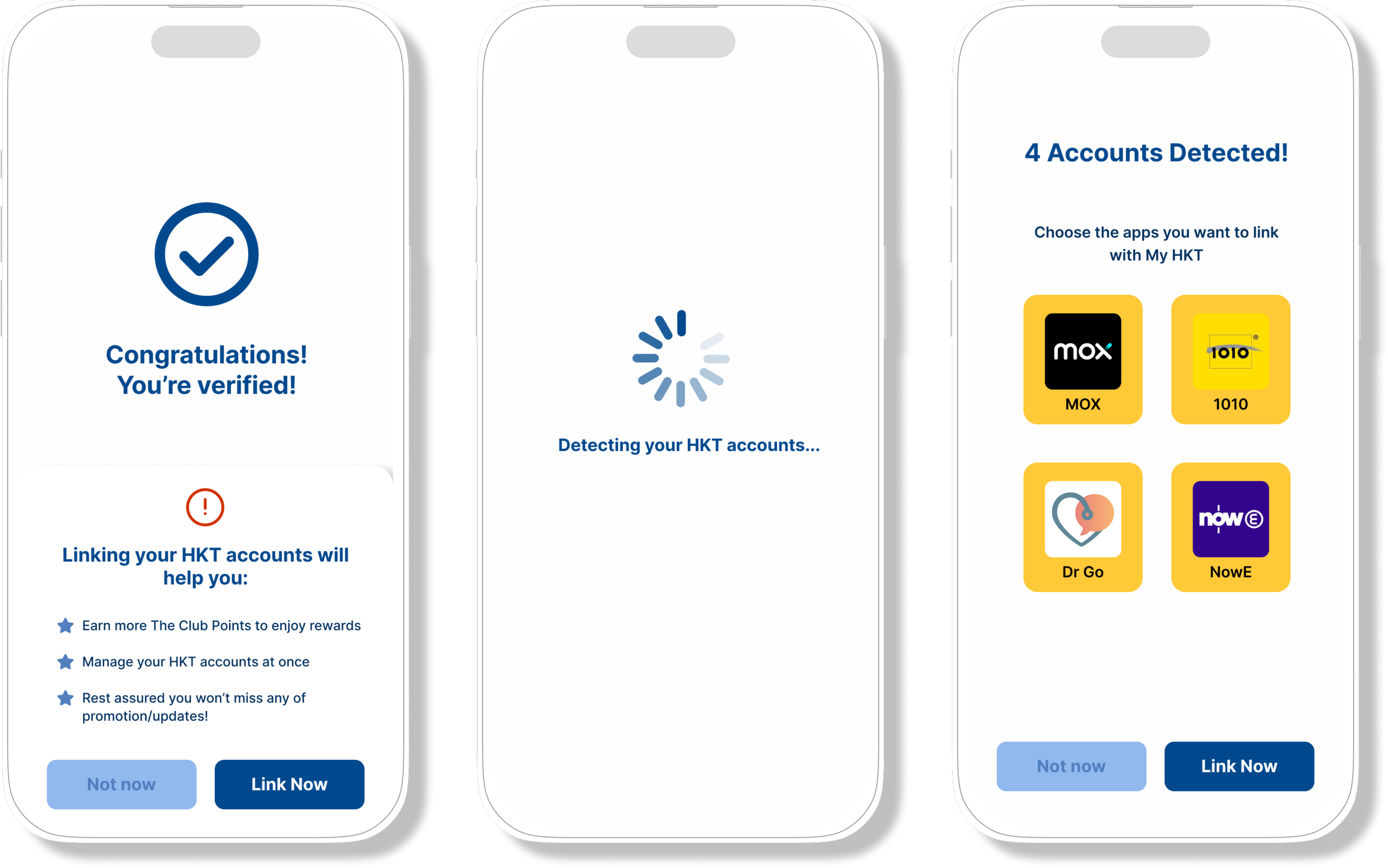
One issue was discovered when respondents attempted to link their children’s app accounts to My HKT.
Before
Users were directed to the account detection screen after verifying their accounts, which most of them found confusing.
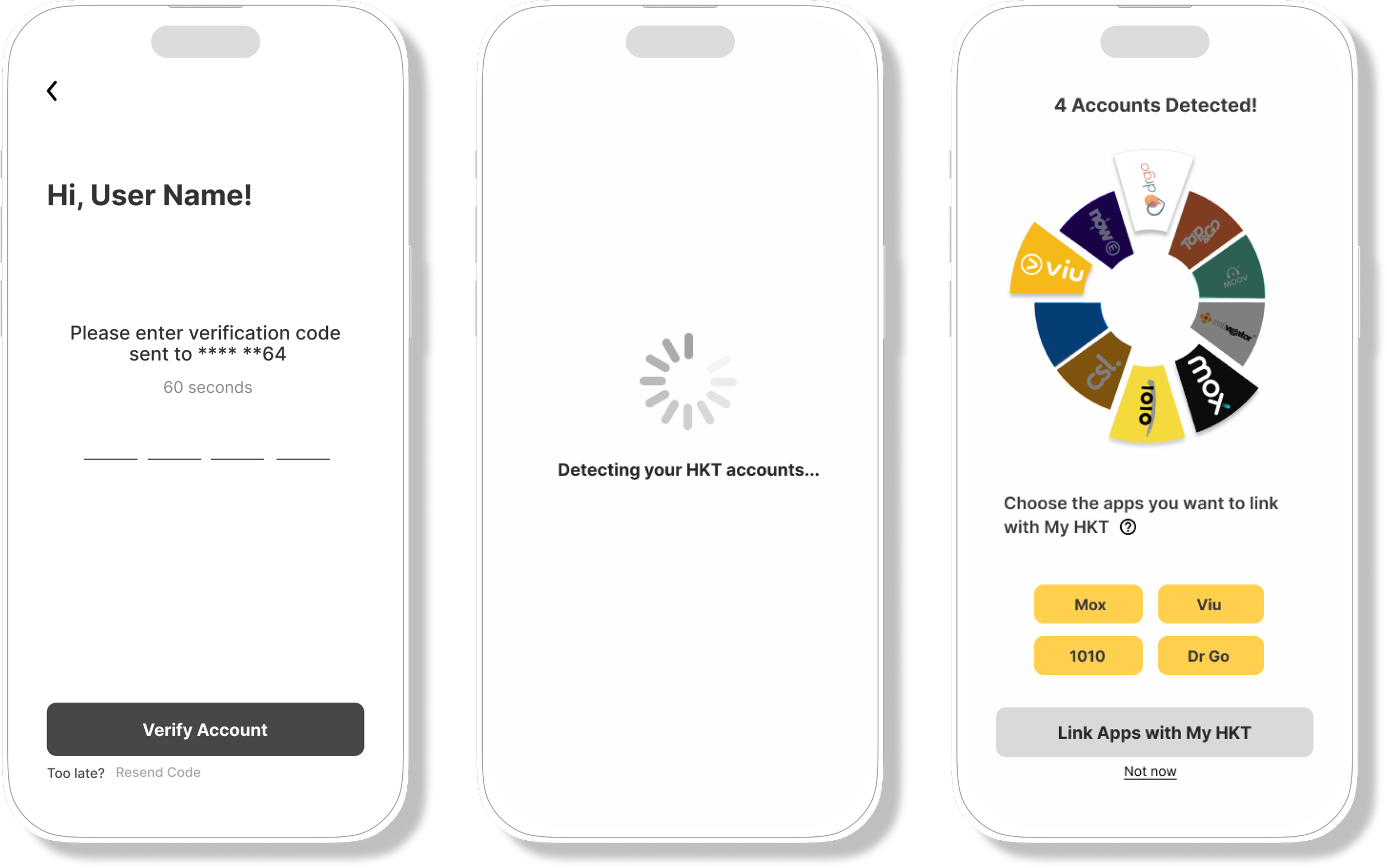
After
Aprompt was added to ask if a user wants to link their accounts, offering users the option of whether or not to link their accounts, which also helps avoid confusion.
Final Screens
The final screens were designed to tackle the problems the app originally had.
Home Screen: Solving App Re-Direction
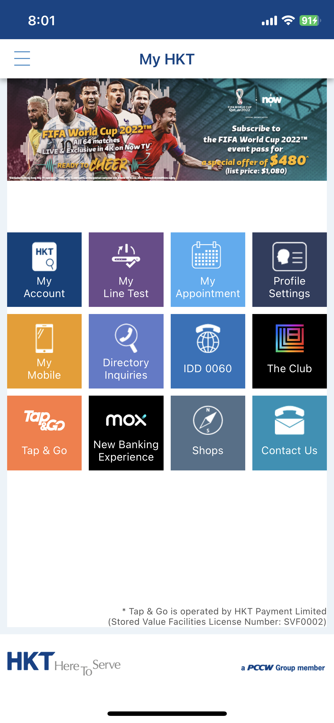
Original Design
The original home screen is uncategorized, which easily leads to confusion. When users tap on the icon of a children's app, such as Tap & Go or Mox, they are redirected to an app that the majority of them found undesirable.

New Design
The new home screen is now more organized. When tapping on children apps, users will be directed to the screens that showcase the services they provide.
Bill Payment: Easier Payment Procedures
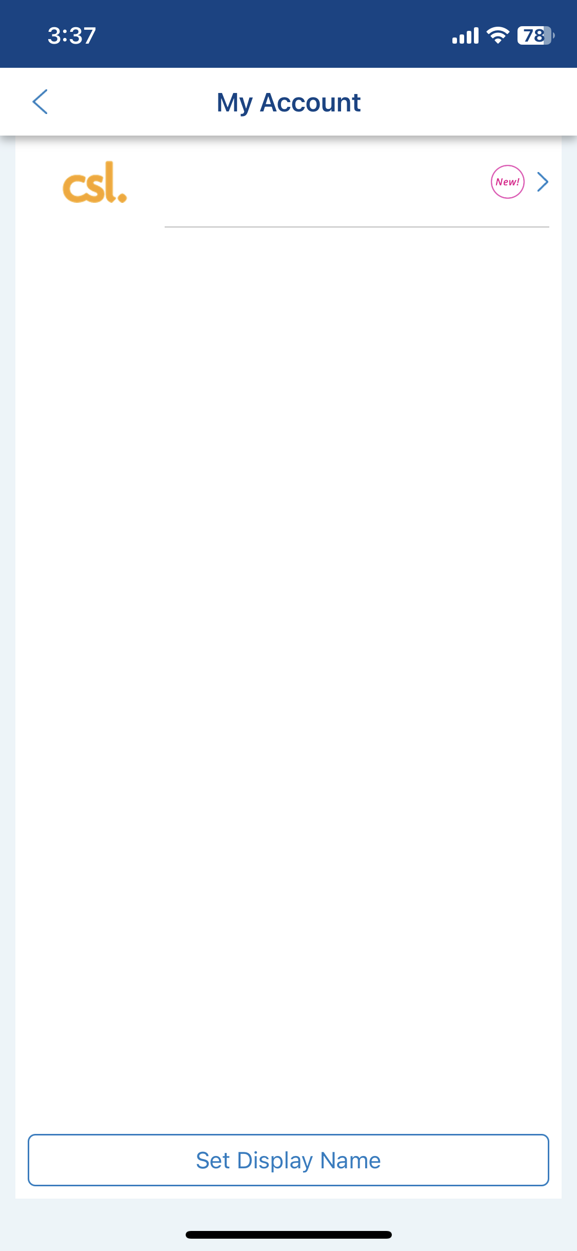
Original Design

Users need to pay each bill separately, which many found inconvenient. When users select a certain payment method, they will be redirected to a website that details how to pay a bill.
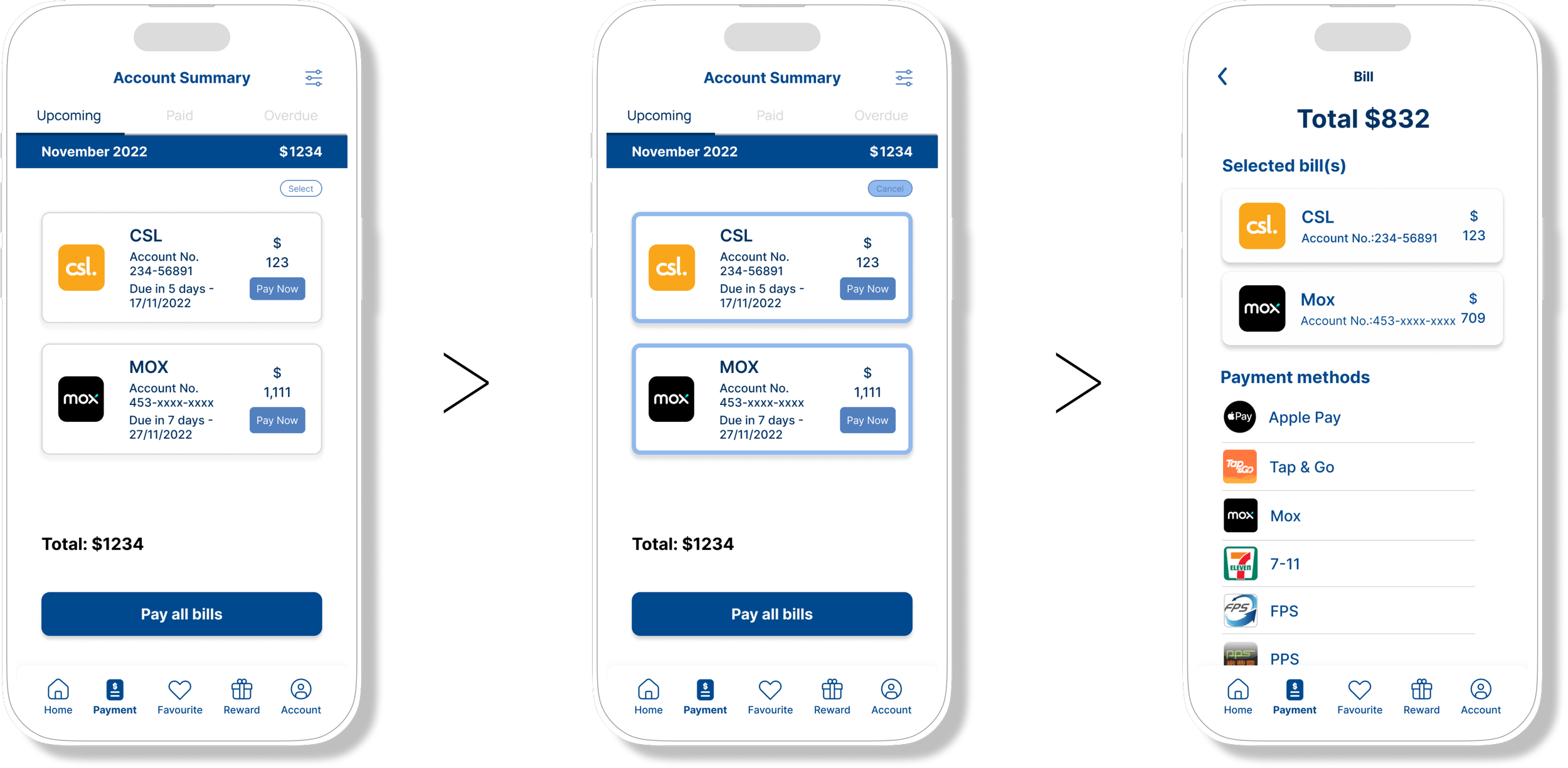
New Design
Users can now settle all of their bill at once. More payment methods have also been added, with some of them allowing for in-app payment.
Reward System: Increase App Usage

New Design
These are the screens that the app did not have at first. Users can earn reward points in a number of different ways, such as by linking their children's app accounts to My HKT. The feature of unlocking each reward level also makes the process more enjoyable.
What have I learnt?
Client Expectation
This was my first hands-on project with a client. It was important to constantly checking in with clients to manage their expectations while ensuring our work aligns with what they want to achieve.
Working in a Large Group
Working in a group of ten people was not an easy task. We were able to coordinate among ourselves despite having ten different perspectives on each individual element by splitting into smaller teams and setting clear deadlines for each task.
Research, Research, and Research
We threw in some early ideas that were later proven unsuitable for the app based on the findings of primary research. Adding a forum section to the app, for example, sounded appealing to both the team and the client in the hopes of increasing user retention. However, the results of the interviews proved otherwise. The responses provided us with insights into what is most important to the users.